The Contractor's Website Checklist: 7 Essentials to Convert Visitors into Leads
You can build stunning kitchens and flawless home additions, but if your website isn’t bringing in qualified leads, it’s just a digital business card. A high-performing website is your best salesperson, working 24/7 to attract, engage, and convert potential clients. For remodelers and contractors in competitive markets like Seattle, a generic site simply won’t cut it. This checklist breaks down the seven essential elements your website must have to turn browsers into booked projects.
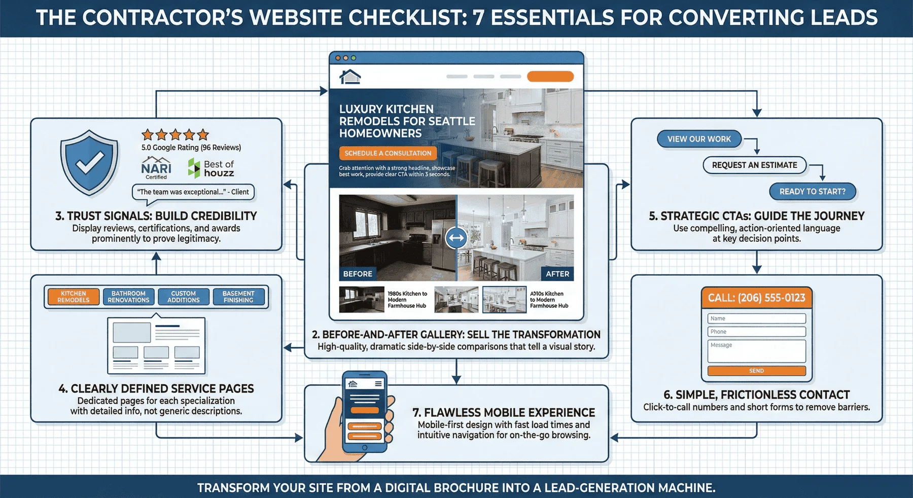
1. A Hero Section That Makes an Instant Impact
What’s the first thing a visitor sees when they land on your site? That top section, known as the “hero section,” has about three seconds to convince them to stay. If it’s confusing, generic, or uninspired, they’ll click away and move on to your competitor.
A powerful hero section must do three things immediately:
- Grab Attention with a Strong Headline: Don’t just say “Your Company Name.” Speak directly to your ideal client’s desire. A headline like “Luxury Kitchen Remodels for Seattle Homeowners” is far more effective than “Seattle Construction Services.” Your headline should answer the visitor’s most pressing question: “Is this company right for my project?” Think about what differentiates your business. Are you specializing in high-end renovations? Do you focus exclusively on historic home restorations? Your headline is prime real estate; use it to communicate your unique value proposition immediately. Consider testing variations that include specific neighborhoods you serve, such as “Bellevue’s Premier Custom Home Addition Specialists,” to create an immediate local connection.
- Showcase Your Best Work: Use a high-quality, professional photo or a short video of your most impressive project. For a high-end remodeler, this could be a stunning kitchen transformation or a beautiful custom home addition. Let the visuals sell the dream. The image you choose should represent the caliber of work you want to attract. If you’re targeting luxury projects, showcase your most luxurious completed work. Avoid stock photography at all costs; homeowners can spot generic images instantly, and they undermine your credibility. If you’re investing in professional photography for your portfolio (which you absolutely should), start with your hero section. Consider using a subtle parallax effect or a background video that shows your craftsmanship in action, creating an immersive first impression that keeps visitors engaged.
- Provide a Clear Call-to-Action (CTA): Tell visitors what to do next. A button like “View Our Work” or “Schedule a Consultation” guides them deeper into your site and closer to becoming a lead. The CTA should stand out visually with contrasting colors and be positioned prominently without overwhelming the hero section. Consider what action makes the most sense for your business model. Some contractors find that “Get a Free Estimate” converts better, while others prefer the softer “Explore Our Projects” approach that nurtures the prospect through more content before asking for commitment. Test different variations to see what resonates with your specific audience.
2. A Before-and-After Gallery That Sells the Transformation
Nothing sells a remodel better than showing the incredible transformation. A dedicated before-and-after gallery is non-negotiable for any contractor. Homeowners aren’t just buying materials and labor; they are buying a new lifestyle, a better space, and a vision brought to life. Your gallery is the ultimate proof that you can deliver.
To help your gallery convert, focus on:
- High-Quality Photography: Grainy, poorly lit phone pictures won’t impress anyone. Invest in professional photography to capture the quality of your craftsmanship. This is especially critical for contractors targeting high-end projects. If you’re bidding on $150,000 kitchen remodels, your photography needs to reflect that caliber of work. Professional photographers understand lighting, composition, and how to showcase architectural details that you might overlook. They’ll capture the texture of custom millwork, the way natural light plays across new countertops, and the spatial flow that makes a renovation truly special. The investment in professional photography typically pays for itself many times over by attracting higher-value clients who appreciate quality and attention to detail. Consider hiring a photographer who specializes in architectural or interior work rather than a general photographer.
- Dramatic Comparisons: Place the “before” and “after” shots side-by-side. This visual contrast creates a powerful emotional impact and clearly demonstrates the value you provide. The human brain is wired to notice differences, and a side-by-side comparison makes the transformation undeniable. For maximum impact, ensure your “before” and “after” photos are taken from the same angle and perspective. This allows viewers to immediately grasp the scope of the transformation without any confusion. Consider using interactive sliders that allow visitors to drag between before and after images, creating an engaging experience that keeps them on your site longer. Organize your gallery by project type (kitchens, bathrooms, additions) so visitors can quickly find transformations relevant to their own project vision.
- Brief Project Stories: Add a short sentence or two describing the project. For example: “We transformed this outdated 1980s kitchen into a bright, modern farmhouse-style hub for the family.” This adds context and helps prospects envision what’s possible for their own homes. Include details that help potential clients understand the scope: “This 1950s rambler bathroom was completely reconfigured to add a walk-in shower, double vanity, and radiant floor heating, all while maintaining the home’s vintage charm.” These narratives do more than describe the work; they tell a story that resonates emotionally. Consider mentioning specific challenges you overcame, such as “We navigated complex permit requirements to add this 400-square-foot master suite” or “The homeowners wanted to preserve the original hardwood floors while opening up the entire first floor.” These details demonstrate your problem-solving abilities and expertise, building confidence that you can handle the complexities of their project.
3. Trust Signals That Build Unshakeable Credibility
Why should a homeowner trust you with their six-figure renovation project? Your website needs to answer this question immediately with clear and convincing trust signals. These are elements that prove your legitimacy, expertise, and reliability.
Your website must prominently display:
- Customer Reviews and Ratings: Feature snippets of your 5-star Google reviews. A high rating from dozens of happy clients is one of the most powerful conversion tools. Don’t just display a star rating; pull actual quotes from real customers that speak to specific aspects of your service. For example: “The team at [Your Company] completed our kitchen remodel on time and on budget. Their attention to detail was exceptional, and they treated our home with respect throughout the entire process.” These testimonials should address common concerns that prospects have: Will they stay on budget? Will they finish on time? Will they be professional and communicative? Consider featuring video testimonials for even greater impact; seeing and hearing a satisfied customer is exponentially more persuasive than text alone. Update your testimonials regularly to show recent projects and maintain relevance. If you have a 5.0 rating from 96 reviews (like many top contractors), make this prominently visible on every page of your site.
- Industry Certifications and Awards: Are you a certified remodeler? Have you won local “Best of” awards? Display these badges proudly. They act as third-party endorsements of your quality. Certifications like NARI (National Association of the Remodeling Industry), EPA Lead-Safe Certified, or manufacturer-specific credentials (such as being a certified installer for premium cabinet or window brands) demonstrate your commitment to professional standards and ongoing education. If you’ve been recognized by publications like Seattle Magazine’s “Best Remodeler” or have been featured in Houzz’s “Best of” awards, these accolades provide social proof that you’re among the elite in your market. Don’t hide these achievements; create a dedicated section near the top of your homepage and include relevant badges on service pages. Consider explaining what each certification means; many homeowners don’t know what NARI certification entails, but when you explain that it requires adherence to a strict code of ethics and proven business practices, it becomes a meaningful differentiator.
- Local Affiliations: Mentioning your membership in the local Chamber of Commerce or BNI chapter shows you are an established and respected member of the community. For Seattle-area contractors, highlighting your involvement in neighborhood business associations, your sponsorship of local events, or your participation in community improvement projects demonstrates that you’re invested in the area beyond just doing business.
- Local Finished Projects: This local connection is crucial for homeowners who want to work with contractors who understand their neighborhood’s specific architectural styles, permit requirements, and community standards. If you’ve completed projects in specific Seattle neighborhoods like Queen Anne, Capitol Hill, or Madrona, mention this local expertise. Homeowners feel more confident hiring contractors who have proven experience navigating their area’s unique challenges, whether that’s working with historic preservation guidelines or understanding local building codes.
4. Clearly Defined Services Pages
Potential clients arrive at your site with a specific project in mind. If they can’t quickly confirm that you offer the service they need, they will leave. Avoid vague descriptions like “remodeling services.” Instead, create dedicated pages for each of your core specializations.
For example, have separate pages for:
- Luxury Kitchen Remodels
- High-End Bathroom Renovations
- Custom Home Additions
- Basement Finishing
Each page should detail your process, showcase relevant gallery photos, and include a targeted call-to-action. This not only improves user experience but also boosts your SEO, helping you rank for specific terms like “basement finishing contractor in Seattle.” When creating these service pages, think like your customer. Someone searching for “luxury bathroom remodel Seattle” wants to see bathroom transformations, not your entire portfolio. Dedicate each service page to addressing the specific concerns, desires, and questions related to that project type. For a kitchen remodeling page, discuss your approach to layout design, your relationships with premium cabinet and appliance suppliers, your process for minimizing disruption during the remodel, and realistic timelines. Include a detailed breakdown of your process, from initial consultation through design, permitting, demolition, construction, and final walkthrough.
For basement finishing, address common concerns like moisture mitigation, egress window requirements, and how you maximize natural light in below-grade spaces. These detailed, service-specific pages accomplish two critical goals: they demonstrate deep expertise in each specialty, and they improve your search engine visibility for high-intent keywords. A dedicated “Custom Home Additions Seattle” page will rank far better than a generic “Services” page that mentions additions in passing. Include FAQ sections on each service page to address common questions and concerns, further demonstrating your expertise while naturally incorporating relevant keywords.
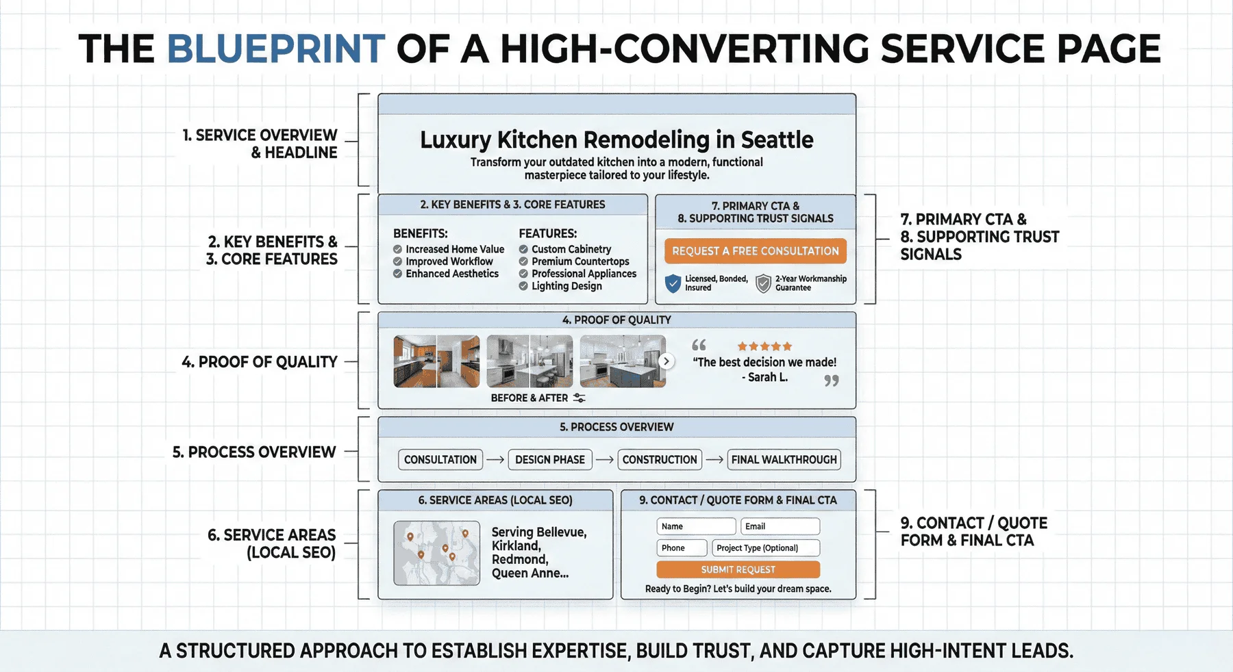
What’s Inside a Service Page
- Service Overview
Short, clear explanation of what the service is and who it’s for. - Key Benefits / Why It Matters
Quick bullets explaining the customer value and outcomes. - Core Features / What’s Included
A brief list of what the service covers (no fluff). - Proof of Quality
Reviews
Before/after photos
Certifications
Years of experience - Process Overview
3–5 steps outlining how it works (creates trust & reduces friction). - Service Areas (If Local)
Keeps the page relevant for SEO and user clarity. - CTA (Clear Call-to-Action)
Example:
Request a Quote
Book a Consultation
Call Now - Supporting Trust Signals
Guarantees
Insurance/licensing
Quick response times
Financing options (if applicable) - Contact / Quote Form
Simple, short fields to increase conversions.
5. Strategic and Compelling Calls-to-Action (CTAs)
A single “Contact Us” link in your website’s footer is not a lead generation strategy. High-converting website design guides visitors toward taking action at multiple points. Your CTAs should be strategically placed and use compelling, action-oriented language.
Think about where a visitor might be ready to take the next step:
- After Your Hero Section: “Explore Our Projects”
- On a Service Page: “Request an Estimate for Your Bathroom Remodel”
- Below Your Before-and-After Gallery: “Ready to Start Your Transformation?”
- At the End of a Blog Post: “Have Questions? Schedule a Free Consultation”
Vary your CTAs and make them specific to the content on the page. This makes the user’s journey feel natural and intuitive, increasing the likelihood they will reach out.
Understanding the psychology behind effective CTAs can dramatically improve your conversion rates. Not every visitor is ready to “Request an Estimate” on their first visit; some are still in the research phase, comparing contractors and gathering ideas. Create a hierarchy of CTAs that match different stages of the buyer’s journey. For visitors early in their research, offer low-commitment actions like “Download Our Kitchen Remodeling Guide” or “View Our Project Gallery.” For those further along, offer “Schedule a Free Consultation” or “Get a Detailed Estimate.”
The language you use matters tremendously. Action-oriented phrases that create urgency or emphasize value convert better than passive language. Compare “Contact Us” with “Schedule Your Free Design Consultation Today”; the latter is specific, emphasizes the value (free consultation), and creates gentle urgency (today). Test different CTA colors, sizes, and positions to optimize performance. Generally, CTAs should stand out visually from the rest of your page through contrasting colors, but they should still feel cohesive with your overall brand design. Consider using first-person language in your CTAs, such as “Show Me Your Work” instead of “View Our Work.” Studies show first-person CTAs can increase conversion rates because they feel more personal and less sales-oriented.
6. A Simple, Frictionless Way to Get in Touch
You’ve done all the hard work to convince a visitor to contact you. Don’t lose them now with a complicated contact process. Your contact information should be easy to find, and your contact form should be short and simple.
Make sure your website has:
- A Click-to-Call Phone Number: Your phone number should be prominently displayed in the header and footer of every page, and it should be clickable on mobile devices. For contractors, phone calls often convert at higher rates than form submissions because they allow for immediate conversation and rapport-building. Make your phone number impossible to miss by using a large, bold font, and consider using a contrasting color to make it stand out. Phone numbers are a strong asset for desktop users as they provide them with an immediate point of contact. On mobile devices, ensure the number is tap-to-call so visitors don’t have to manually dial. If you use call tracking numbers to measure which marketing channels drive phone leads, ensure these numbers are properly implemented across your site. Some contractors find success by including a brief message near their phone number, such as “Call now to discuss your project” or “Speak directly with our owner.”
- A Simple Contact Form: Only ask for the essentials: name, email, phone number, and a brief message about their project. Long, intimidating forms kill conversions. Every additional field you add to a contact form decreases the likelihood that someone will complete it. Resist the temptation to ask for extensive project details, budget ranges, or timeline information upfront; you can gather these details during your follow-up conversation. The goal of your contact form is simply to initiate the conversation, not to pre-qualify every lead. Consider adding a simple dropdown menu for project type (kitchen, bathroom, addition, etc.) to help you route leads appropriately, but keep it optional. Ensure your form is mobile-friendly with large, easy-to-tap input fields. Add a clear privacy statement near your form submission button to reassure visitors that you won’t spam them or share their information. Consider implementing an auto-response email that confirms receipt of their inquiry and sets expectations for when they’ll hear from you.
- A Dedicated Contact Page: Include your phone number, form, email address, and a map of your service area to reinforce your local presence. Your contact page should make it as easy as possible for prospects to reach you through their preferred method. Some people prefer phone calls, others prefer forms, and some want to send a direct email. Accommodate all preferences. Include your physical address (even if you don’t have a showroom) to establish legitimacy; businesses with verifiable addresses are more trustworthy than those without. Use an embedded Google Map showing your service areas, highlighting neighborhoods like Kirkland, Bellevue, Redmond, and other Seattle suburbs you serve. This visual representation of your service area helps prospects immediately confirm you work in their location. Consider adding your business hours, response time expectations, and even photos of your team to humanize your business. If you have a showroom or office where clients can visit to see material samples, make this clear and include directions. Lastly, we want to include reviews within the contact page. This will encourage people further to get a true testament of your business and scale the opportunity for them to take another step and reach out.
7. A Flawless Mobile-Friendly Experience
Today, the majority of your website visitors are browsing on their smartphones, often while sitting on their couch, dreaming about their new kitchen. If your website is difficult to navigate on a mobile device, you are losing leads. It’s that simple. A poor mobile experience signals a lack of professionalism and attention to detail, which is the last thing a contractor wants to communicate.
A mobile-first website ensures that:
- Text is easy to read without pinching and zooming.
- Buttons are large enough to tap with a thumb.
- Images and galleries load quickly and display correctly.
- Navigation is simple and intuitive.
Mobile optimization goes far beyond simply making your site “responsive.” A truly mobile-optimized contractor website is designed with the mobile user experience as the primary consideration, not an afterthought. Consider how people use their phones differently from desktop computers; they’re often multitasking, have shorter attention spans, and expect instant information. Your mobile site should load in under three seconds; every additional second of load time dramatically increases bounce rates. Compress images without sacrificing quality, minimize unnecessary scripts, and leverage browser caching to improve speed.
Navigation on mobile devices should be streamlined and thumb-friendly. Implement a “hamburger menu” that expands to show your main navigation options, but also consider adding quick-access buttons for high-priority actions like “Call Now” or “View Gallery” that remain visible as users scroll. Your click-to-call phone number should be sticky (remaining visible at the top or bottom of the screen) so visitors can contact you instantly from anywhere on your site. Test your contact forms on actual mobile devices. Are the input fields large enough? Does the keyboard cover important information? Can users easily tap the submit button?
Is Your Website Ready to Generate Leads?
Your website is your digital handshake, your portfolio, and your sales pitch all in one. By implementing these seven essential elements, you can transform your site from a passive online brochure into an active lead-generation machine. Take an honest look at your current website and see where it falls short. A few strategic improvements could be the key to unlocking consistent, high-quality leads for your contracting business.
We Can Help You Build a Better Website
Are you looking to scale your remodeling business? It starts with a website that converts. If you have questions about improving your site or are ready to build a lead-generating machine, contact us for a free consultation.