Lakeside Industries
The objective
Update and modernize Lakeside Industries' website, better showcasing their culture, values, and team in order to attract new customers and talent. The old website was outdated and did not have the engaging content or compelling visuals needed to make a real impact. Help Lakeside stand out from the crowd and show they are different from other large corporations.
The challenge
The complexity of custom animations and figuring out a seamless user pathway that made the most sense for Lakeside's extensive network of locations and array of open career positions. The homepage was missing call-to-action buttons and key information. Each service needed its own dedicated page. The careers page lacked information on culture, testimonials, and benefits. Key employees were not highlighted, and the website lacked updated, visually compelling assets.
Our approach
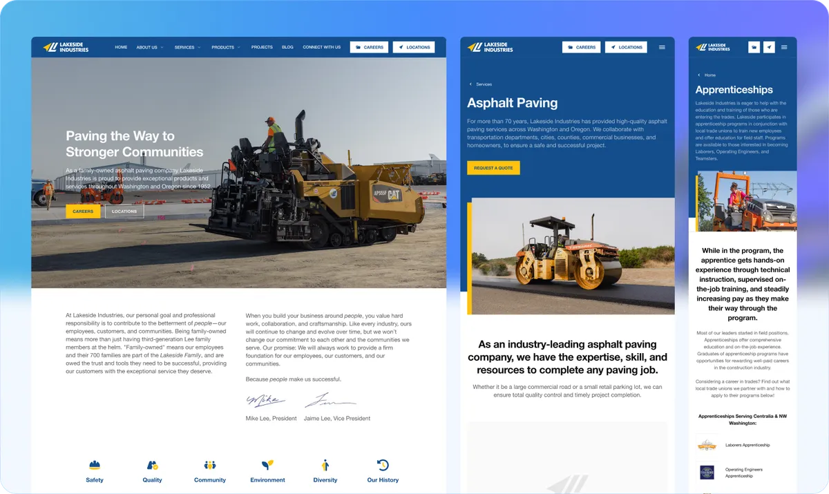
Developed three custom animations: a company history timeline highlighting key milestones in Lakeside's journey, a careers map linking roles to educational levels and depicting pathways for career progression, and location filtering streamlining access to location-specific information. The new website features a full-width hero video of a worksite using drone footage, a seamless and intuitive user interface, optimized content, compelling visuals, and interactive elements.
Key deliverables
Capture High-Quality Assets
Captured high-quality assets that draw users in and show the Lakeside team in action. The homepage features a full-width hero video of a worksite using drone footage.
Custom Animations
Created three custom animated pages featuring a company history timeline, a careers map, and location filtering.
Modern and Seamless Design
New website with a seamless and intuitive user interface enriched with optimized content, compelling visuals, and interactive elements.
The process
Research
Conducted comprehensive market and target audience analysis.
User Personas
Created detailed user personas to hone in on Lakeside's target market.
User Flow
Meticulously mapped out the user flow on Lakeside Industries' website.
Wireframe
Wireframes served as blueprints, outlining the structure and layout of each page.
Design System
Implemented design systems ensuring consistency in branding, typography, colors, and UI elements across all pages.
Development
Through meticulous coding and testing, ensured seamless functionality across devices and browsers.


Research & findings
Conducted thorough analysis of Lakeside's website to identify areas for improvement. Delved into existing site structure, content, and user experience to pinpoint opportunities for enhancement. Extensively researched target audience to understand personas, challenges, goals, and needs.
Missing CTAs
Homepage missing call-to-action buttons and key information like locations, careers, and latest news.
No Service Pages
Each service needed its own dedicated page for more detailed offerings information.
Weak Careers Page
Careers page lacked information on culture, testimonials, and benefits.
Hidden Culture
Website failed to convey company culture or values. Key employees were not highlighted.
Outdated Assets
Website lacked updated and visually compelling photos and videos of the Lakeside team in action.
Isolated Projects
Project page was not accessible from other important pages on the site.
Recommendations
Structure homepage to provide key information with clear calls to action. Contact and location details readily available.
Add compelling calls to action across the entire site.
Create dedicated service pages for more detailed offerings information.
Include benefits, testimonials, and FAQs on the careers page.
Add engaging, high-quality photos and videos. Showcase company history, awards, recognitions, and values.
Add headshots and job titles highlighting key employees.
Take new photos and videos of Lakeside team in action.
Add links to home and services pages from the project page.
User personas


Design system
Seamlessly integrated Lakeside's fonts and colors to create a cohesive visual identity resonating with the company's branding. Helvetica Neue typography, 12-column grid system, and a brand palette of Blue, Yellow, Green, Red, White, and Black.


Visual design
Comprehensive website collage showcasing paving machinery, the management team, service details, company commitment, history, recognitions, and contact information.

"Integrity redesigned and built our new company website from the ground up. They did a fantastic job and I believe the website showcases our company well. Matt, Dylan, and their team were great to work with. They were very professional and ran organized meetings. They helped us navigate the creative process as well as the practical aspects. We are very proud of what was accomplished."

Jaime Lee
President, Lakeside Industries
Key takeaway
Companies with deep histories need websites that tell their story in a modern, engaging way. Custom animated timelines and interactive career maps turn corporate content into compelling experiences.

Want results like these?
Every project starts with a conversation. Tell us where you are and we'll show you what's possible.