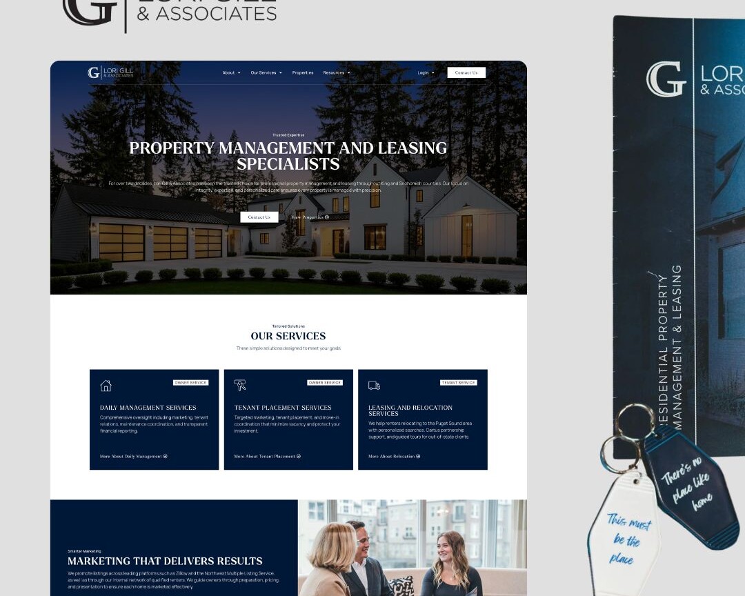
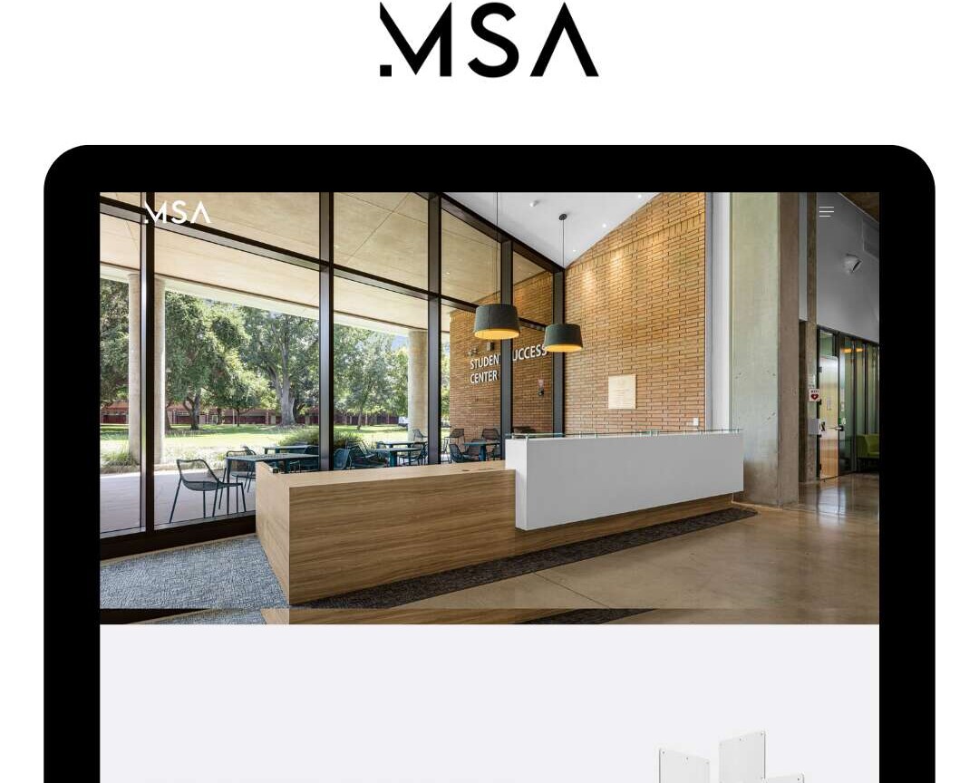
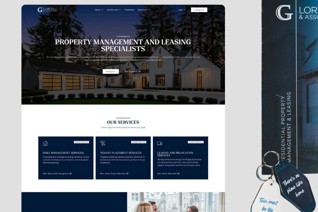
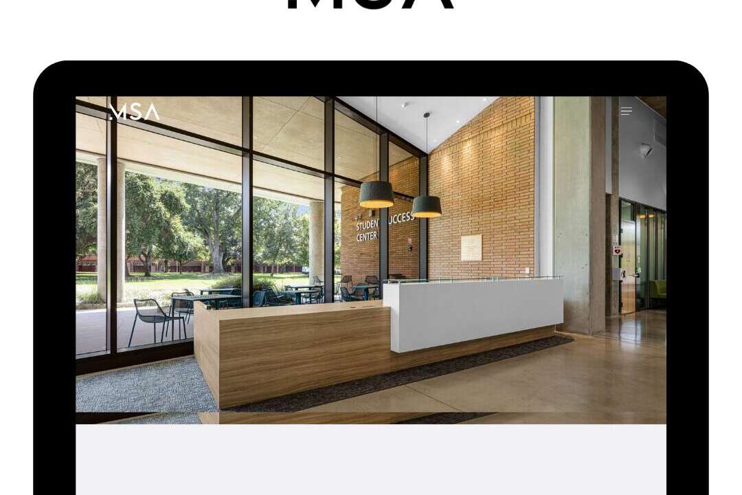
Web Design for CreArt Studio
Web Design / UI/UX Design / Digital Strategy
Location
Seattle, WA
Established
2024 (Brick-and-Mortar)
Website
Industry
Creative Education & Enrichment
Objective
The primary goal was to elevate CreArt Studioz from a boutique local operation to a scalable enterprise-ready brand. We aimed to modernize the digital experience to reflect the studio’s premium creative services while engineering a high-performance backend capable of supporting aggressive expansion and franchise-level operations.
1
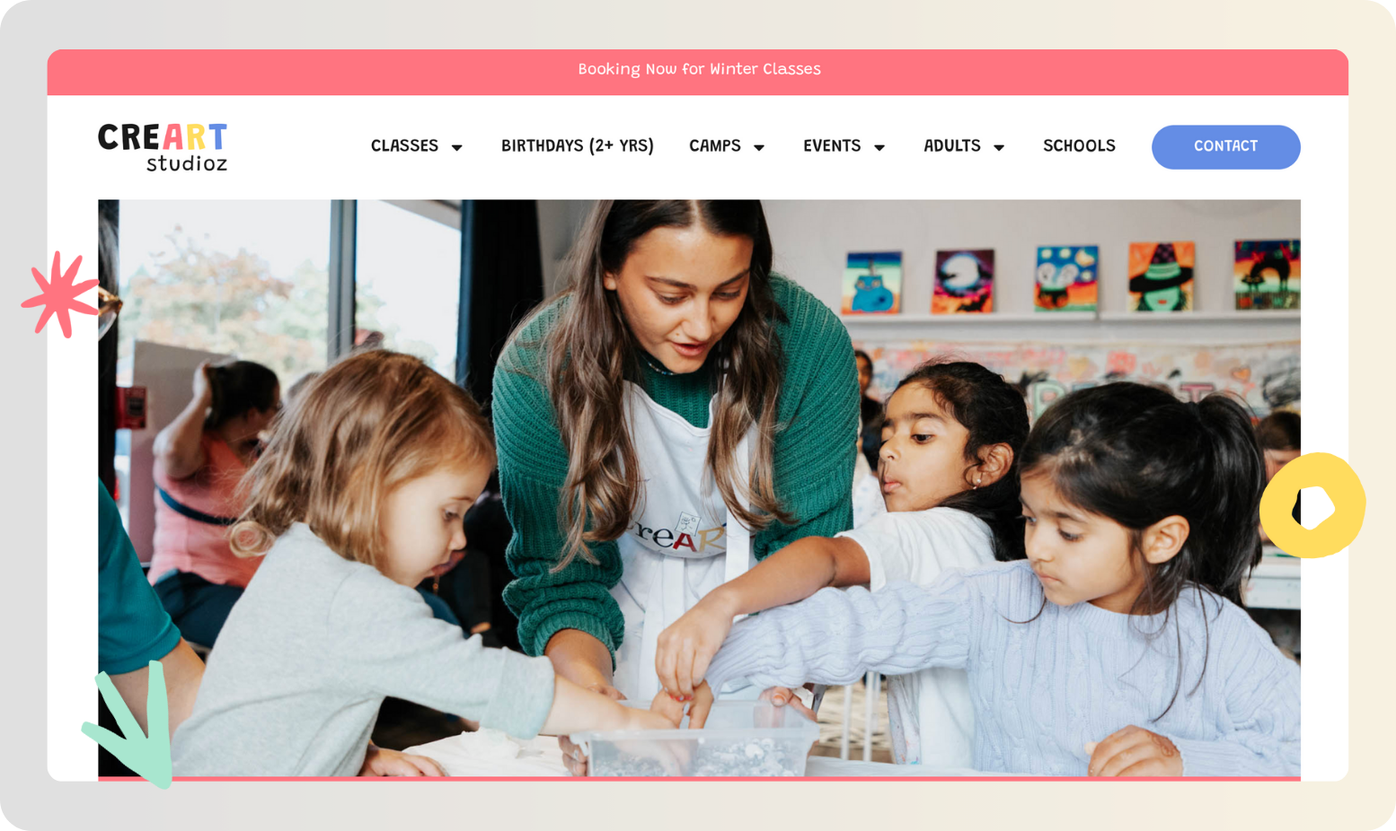
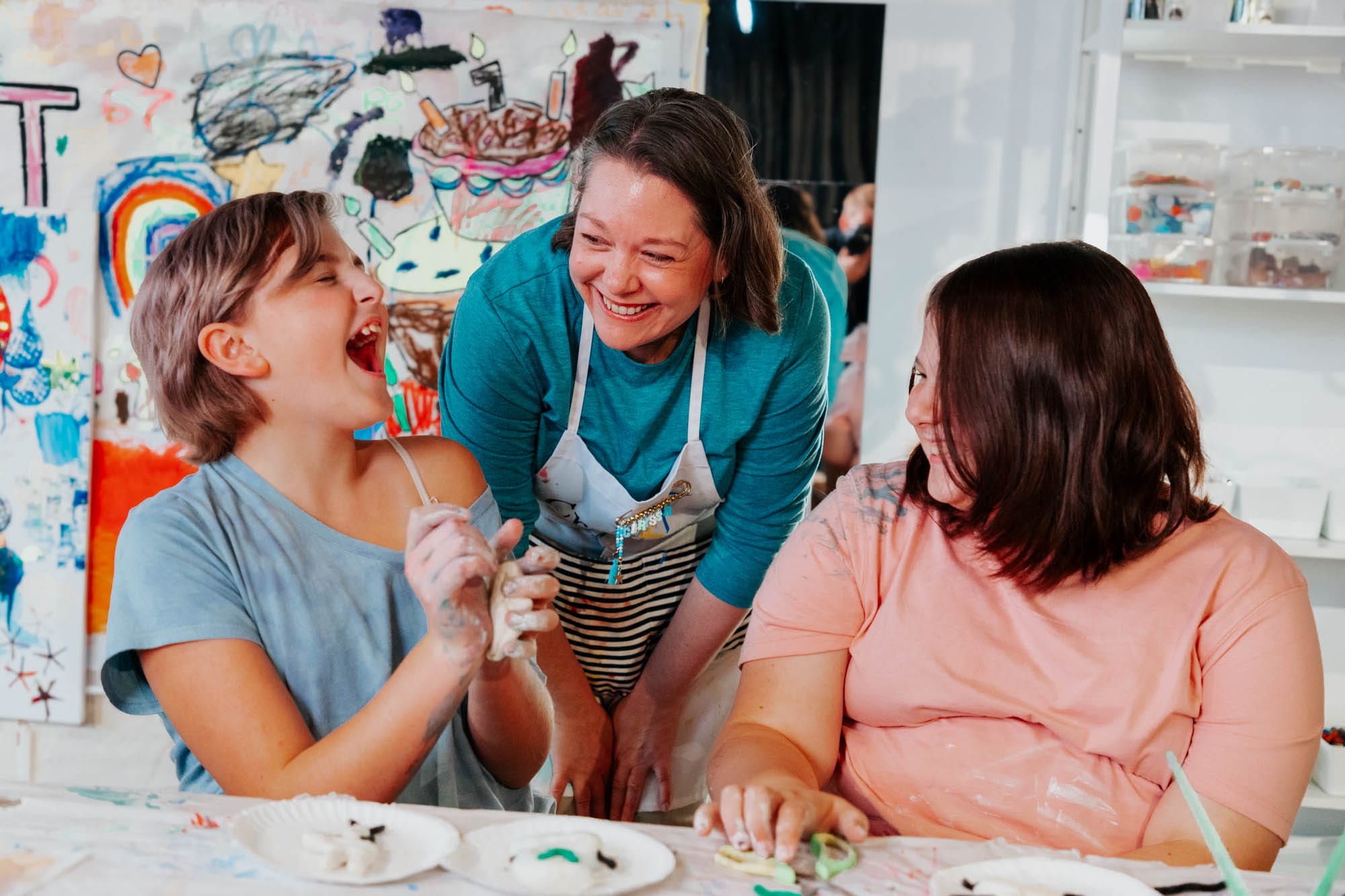
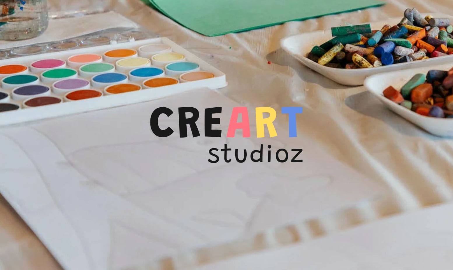
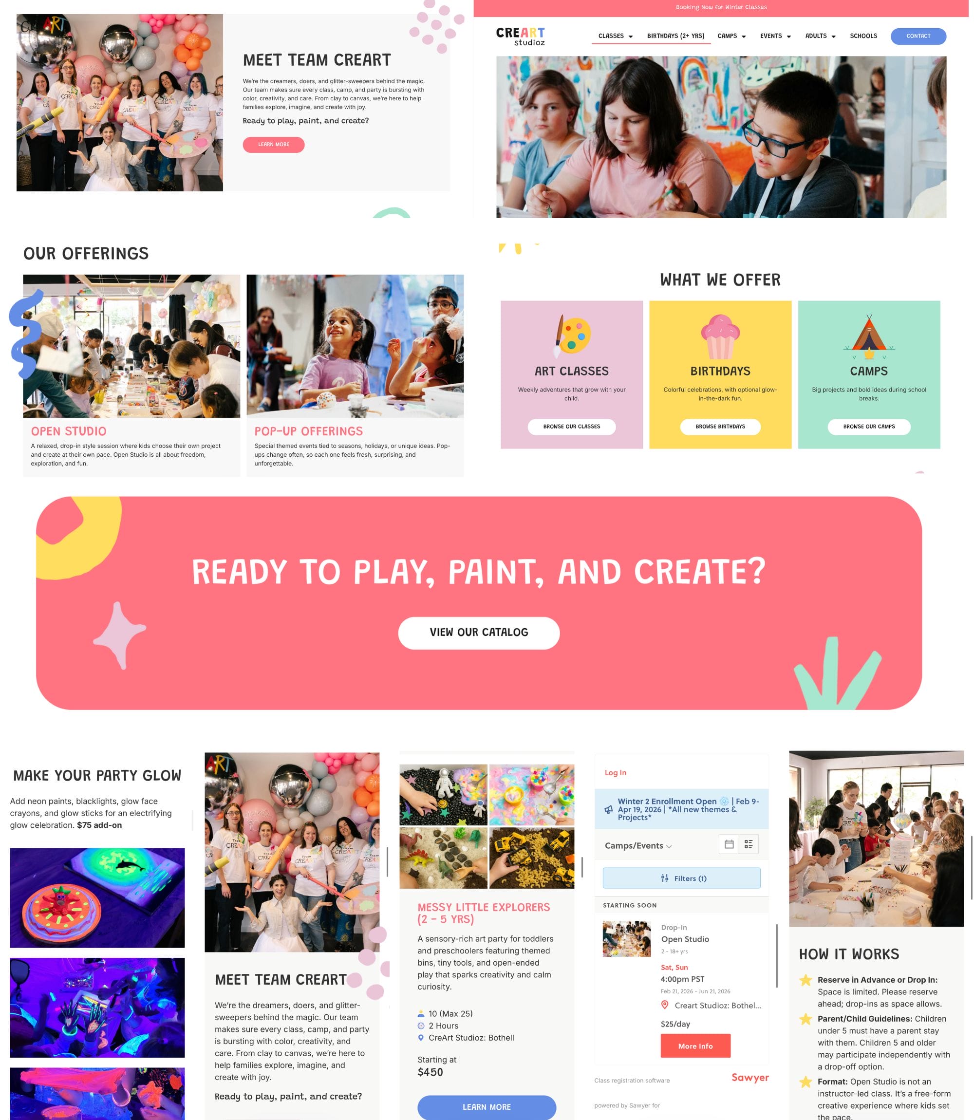
High-Impact Visuals
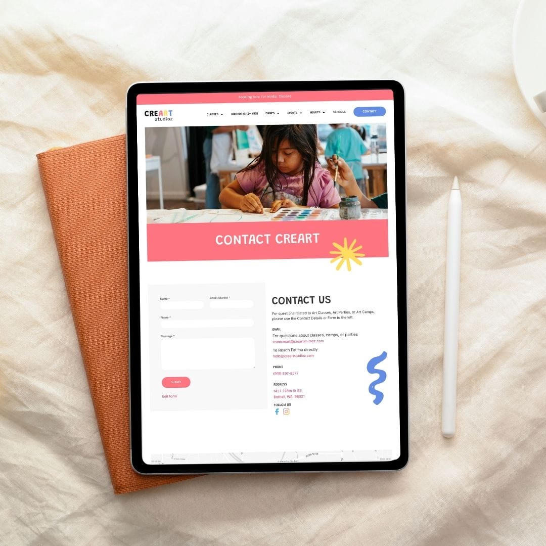
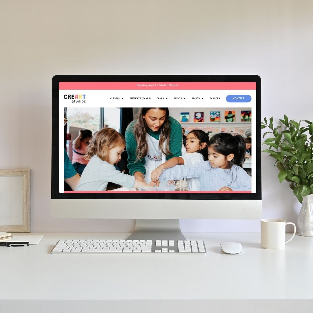
We used vibrant, high-quality media of the “Makers Space” and “Paint Bar” to capture the studio’s energy. By balancing bold imagery with a structured UI, we effectively communicated the “Play, Make, Create” philosophy.
2
Scalable Multi-Location Backend
The platform features a “Location-First” architecture, allowing for centralized brand control with decentralized management. This enables the business to scale across new territories with localized data and rosters.
3
Automated Operations
We replaced fragmented tools with a unified system that automates annual fees and booking workflows. A streamlined parent portal with predictive data entry ensures a fast, “minimal-click” checkout for returning families.

Challenge
As CreArt Studioz prepared for expansion, their legacy systems could not support the complexity of high-volume bookings and multi-location management. The challenge was to eliminate manual administrative hurdles—such as registration fee tracking and unbranded communications—without losing the personalized, creative feel that defines the brand.
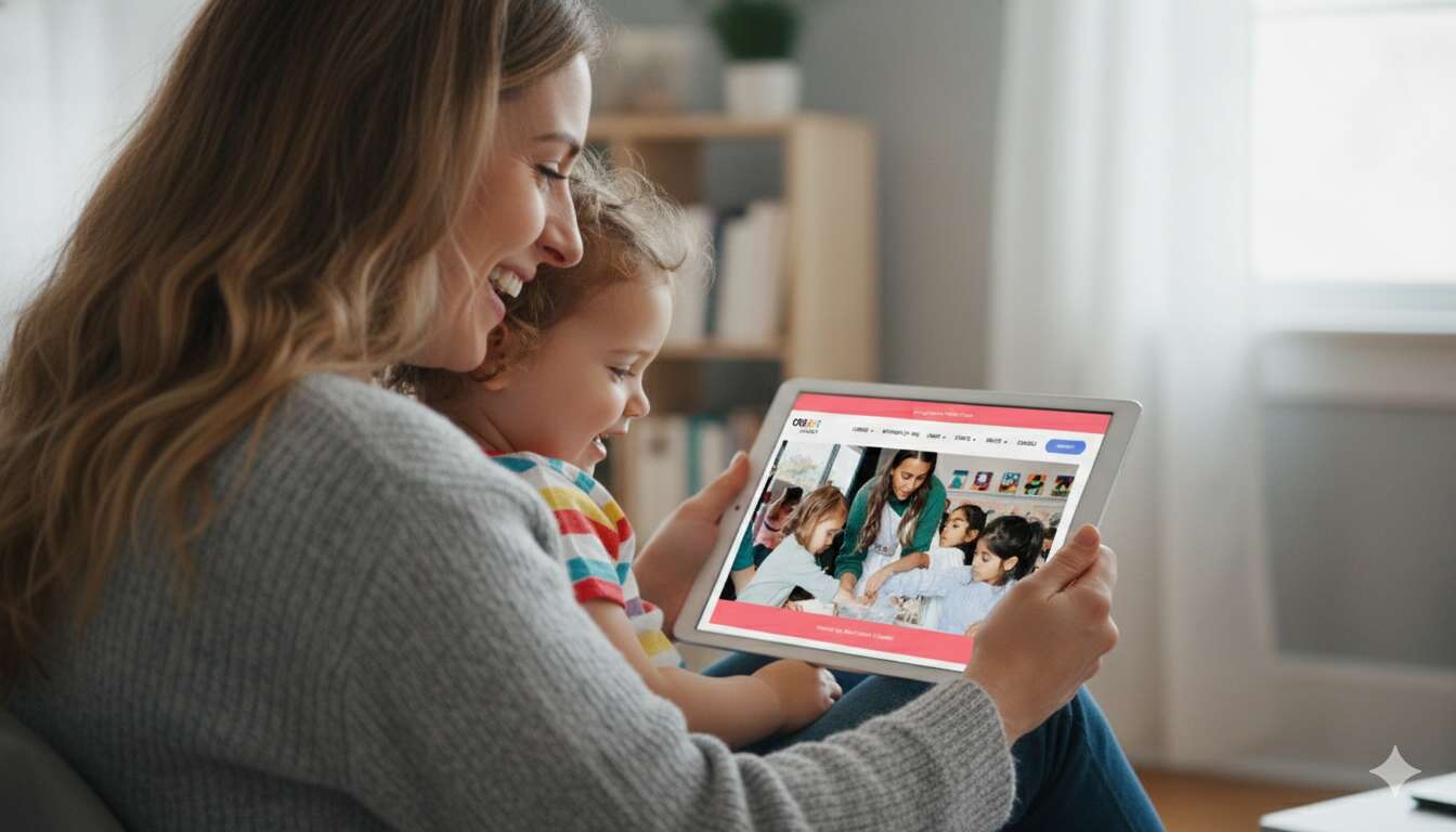
Our solution
We engineered a frictionless digital strategy that maps the entire user journey from discovery to final confirmation. By streamlining every touchpoint, we successfully reduced booking abandonment and enhanced operational efficiency. This transition ensures a seamless experience for families, allowing them to navigate complex schedules and service offerings with total ease.
Central to this experience is a custom booking engine that integrates recurring classes, seasonal camps, and tiered event pricing into a single, intuitive interface. To ensure long-term scalability, we established a comprehensive design system that maintains a consistent brand style across the entire platform. This is supported by a centralized administrative dashboard that automates roster management and parent communications, providing a professional and cohesive foundation for future expansion.
Process of CreArt Studioz
1
Research
Analyzed user behavior to map a conversion-focused, simplified journey.
2
User Personas
Developed targeted profiles to ensure messaging resonates with families.
3
UX Prototyping
Prioritized mobile-first wireframes for effortless booking on any device.
4
Brand
Created a scalable library to maintain visual consistency everywhere.
5
Booking System
Built a sophisticated engine for classes, camps, and events.
6
Development
Automated workflows to eliminate manual oversight and increase speed.

Moodboard & Concept
The visual direction bridges the gap between artistic chaos and operational structure. We utilized a “Digital Canvas” concept: a clean, minimalist UI that allows the vibrant, messy colors of the process-art to stand out without overwhelming the user.
Key Findings
- Booking Abandonment: High drop-off rates due to excessive form fields and manual steps.
- Operational Leakage: Annual registration fees were often missed due to manual tracking.
- Brand Fragmentation: Unbranded, generic emails created a disconnect in the customer experience.
- Data Silos: Information was not partitioned by location, complicating accounting and scaling.
- Static Content: The site lacked the high-quality video assets needed to convey studio energy.
Recommendations
- Frictionless Checkout: Implement profile-based autofill to reduce booking time for returning families.
- Automated Revenue: Integrate logic to automatically apply annual registration fees at point-of-sale.
- Unified Communication: Deploy branded email workflows for automated confirmations and reminders.
- Scalable Architecture: Build a location-aware database to support future franchise-wide reporting.
- Dynamic Media: Use full-width hero videos to immediately showcase the "Makers Space" experience.
- Admin Empowerment: Create a central dashboard for staff to manage rosters and schedules effortlessly.
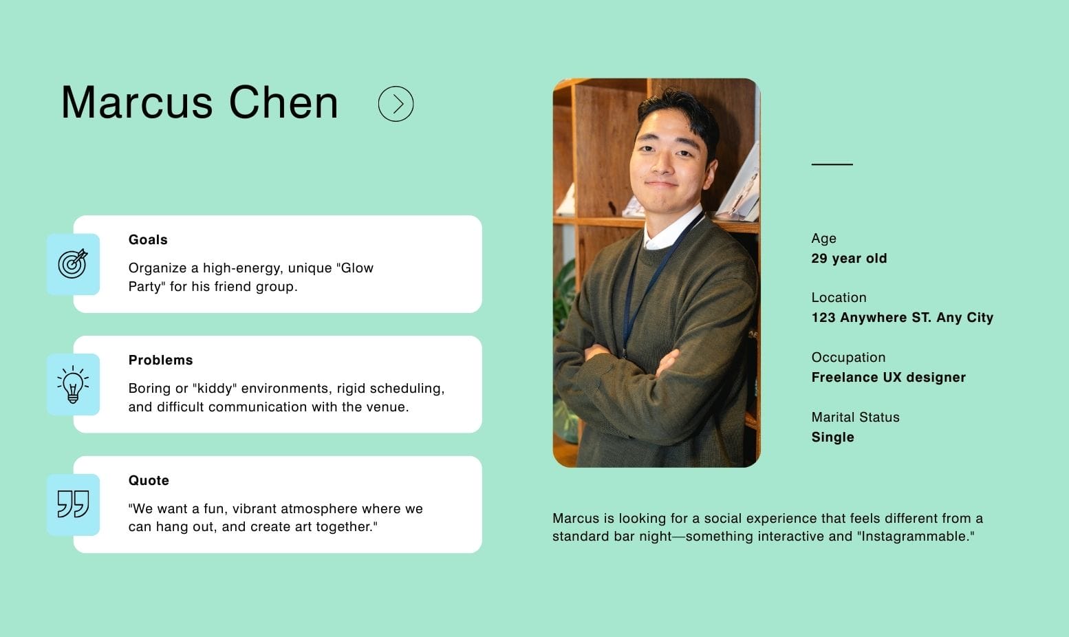
UserPersonas


Visual Design


Their authenticity, empathy, and commitment to shared values created a trusting, collaborative experience.
I can’t thank you all enough for bringing our vision to life. Every detail, every tweak, every late night fix it all shows how beautifully everything came together. This milestone means so much and it wouldn’t have been possible without your brilliant behind the scenes.
Fatima
Director/Founder